Design

INTRODUCTION

Up until 2020, The Shield was designed and created on Adobe InDesign. But in March when the pandemic hit, the editors were forced to pivot and shift to a new platform, LucidPress that is browser-based and more easily accessible to students working from home on district-issued Chromebooks. So, for my first three years on staff, I learned to design our print issues using a program that we had no intention of sticking with long-term. But there’s never a good time to switch technology, especially once staffers have adjusted to the new software.

As I took on the role of editor-in-chief during the 2022-23 school year, I didn’t think switching to InDesign was achievable, so I instead looked to improve our design through other means. Despite the limitations of LucidPress, a non-industry standard program, we succeeded in revamping our design by following trends and intentionally focusing on utilizing engaging visuals. Our creative approach led to much success, earning The Shield a CSPA Gold Crown, an NSPA Pacemaker and an ILPC Gold Star — the first time in recent history that The Shield was recognized with top awards by all three organizations.

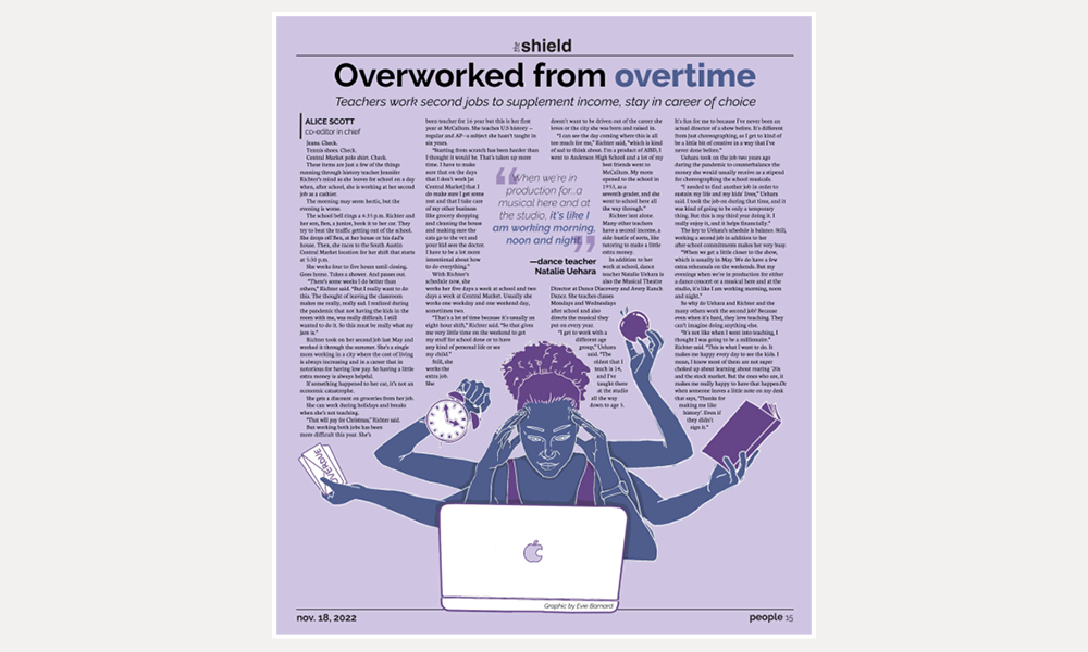
Like I said, there’s never a good time to switch technology, but having a staff and editorial board experienced in creative problem-solving made me confident in our ability to return to InDesign. Because my design experience was solely based in LucidPress, I knew I would need to spend the summer learning the new program if I was going to be able to teach it to my staff. I also knew I wanted to create a Staff Manual of norms and policies for the upcoming school year, so I combined these goals into a hands-on project that would leave me prepared to lead my staffers through this transition.

The process of learning a new software was tedious — every time I needed to use a new tool I had to Google “How do you do BLANK in InDesign?” until the processes became intuitive. What I learned was, the way LucidPress and InDesign work is not all that different. InDesign just has a more robust collection of features to allow for creative design work.

By the end of the summer, I was ready to lead my staff with a 28-page staff manual and a comprehensive knowledge of InDesign.

Scroll through this page for examples of my design work created across multiple platforms. 

Print Design

Opioid death rate still increasing

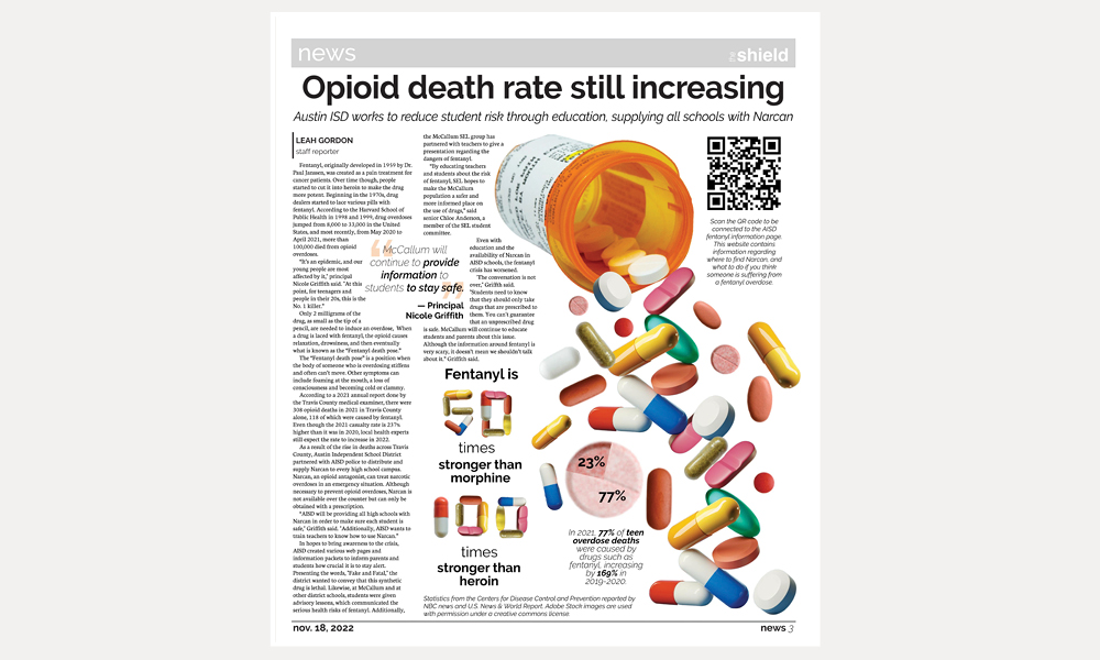
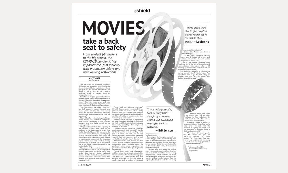
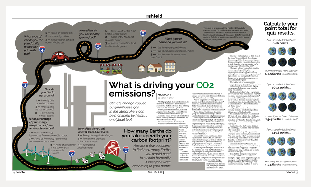
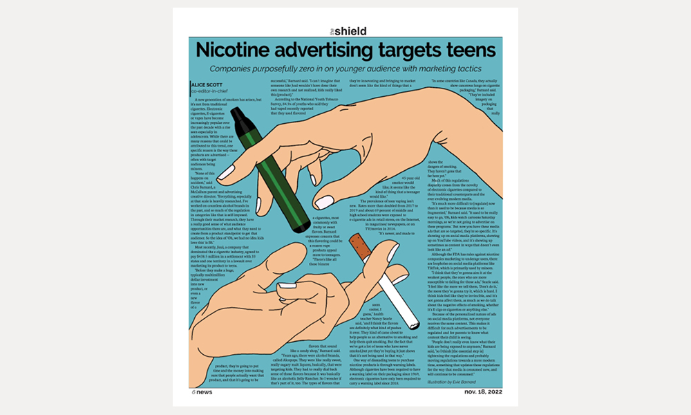
Our second issue of my junior year centered heavily around the fentanyl crisis and drug use, which presented the challenge of finding visuals to accompany stories, as we did not have usable images from our student photographers. As I was designing our page three news story, I decided to incorporate stock photography to create an eye-catching design to grab reader attention for this important topic. But because my dominant image was a stock photo, I wanted it to offer something more than just breaking up text, so I manipulated the pills to create a pie chart and numeral shapes that highlighted the noteworthy statistics regarding the Fentanyl crisis. This page forced me to get creative while working with limited photo options and incorporated design strategies to give readers new information that they would not have gotten from the story alone.

Recognitions: Excellent – news page design, TAJE (2023)

Overworked from overtime

This story focused on specific McCallum teachers who work second jobs to supplement their teaching income. Although I could have utilized photos of my teacher sources for this page, I wanted the design to apply to the more general topic of overworked teachers — a somewhat universal feeling of public school educators. I was also concerned that incorporating a photo of an “overworked” teacher might cast them in a negative light or infringe on their privacy — which are not hallmarks of ethical journalism. I connected the artwork to the rest of the page through the use of color, to create a unified look throughout the design. Even though the process of creating this page was relatively simple because there are not very many elements on the page, it taught me that a complex design doesn’t necessarily mean a better design. Sometimes, a simple design is eye-catching enough.

A Taste of Fascist Peach Cobbler / Following their (day) dreams

During my sophomore year, my Issue 3 story was chosen for the double truck, which meant I got to try out designing a center spread for the first time. For this design, I had to be mindful of proximity and space to tell two different stories about student bands. I also needed to figure out a way to have dominance on the page without making one story seem more important than the other. Because one of the bands, Fascist Peach Cobbler, was made up of students across AISD and only had one McCallum member, I paired a cutout of her with a group photo of the other band, Daydreamer. I also wanted to include the personality of each band in the design, so I decided to use the Fascist Peach Cobbler logo in the headline and got each member of Daydreamer to “autograph” their group photo. This taught me about packaging different stories together in one design, maintaining balance and theme within the page, while also making sure the stories remain separate.

Recognitions: Superior – in-depth news/feature package, TAJE (2023)

Seeing these stars

For our second issue of the year, we wanted to use the space of our double truck to feature multiple students, rather than just one story. The mini-profiles on the page were all about students in the marching band who also are a part of other football game extracurriculars like Blue Brigade, cheer, athletic trainers or the football team. Since these were students who by virtue of their versatility were stars on our campus, I decided to incorporate the year’s marching show title, “Seeing stars” into the theme of the design. I used a black background with white text and used repeated elements like the cutouts and star imagery to allow for continuity and a cohesive look and feel to the page. This helped connect the separate stories and package them together in a visually appealing way.

Recognitions: Second place – newspaper page/spread, NSPA Clips and Clicks (2022); Third place – feature page/spread design, ILPC (2023)

Back to the Beginning

When I got to work designing my story about the new yearbook adviser Frank Webster, I knew I had the chance to do something creative. I wanted to take advantage of how recognizable yearbooks are and design the page around that concept. For the dominant image, I wanted to model a traditional “mugshot” page from a yearbook, so I used school portraits of the sources interviewed in the story and former teachers that Mr. Webster mentioned in his interview as having influenced him. I also utilized contrast by choosing black and white photos to callback to the feel of “old” yearbooks. I even made the pull quote hand-written to give it the feel of a yearbook autograph page entry. This page challenged me to integrate design and photo editing tools to visually represent a story and create a better overall look and feel.

Recognitions: Fifth place – newspaper/newsmagazine design, NSPA Best of Show (2022)

Movies take a backseat to safety

I have a distinct memory of the start of our second issue cycle during my freshman year. Shortly after pitch, the EICs challenged the staff to produce more creative page designs for this next issue. As a new staffer who was still learning the basics of story structure, the idea of letting go of the familiar L-shaped template was daunting. But I also couldn’t disappoint my editors. So I scrolled for hours on Pinterest, looking for something eye-catching that I could model my design off of. When I finally found a page design that layered an “S” through the dominant photo, I was struck with an idea. My story was about the movie industry, so I could incorporate the same idea with a film reel. I used a stock illustration as a dominant photo to draw a reader in. I even got permission from the EICs the break the style guide rules for headline formatting so that the word “Movies” immediately jumped out at the reader. And then, by linking the “S” in the word “Movies” into the spokes of the film wheel, I created a design layer that literally connected the writing to the imagery on the page.

Recognitions: Award of Merit – entertainment package, SIPA Best Visual Competition (2021); Best in Show – headline package, SIPA Best Visual Competition (2021)

What’s driving your CO2 emissions?

For our third issue of the 2022-23 school year, my co-EIC and I decided we wanted to have an environmental-themed issue that focused on local climate related news. Our double truck featured a story on carbon footprint and what students are doing to reduce their CO2 emissions. This put me in an opportune position to create a design that offered more to readers than just visual appeal. I used the page space to make a quiz allowing readers to calculate their carbon footprint. I leveraged road imagery to incorporate an infographic that utilizes contrast in both type and layout to supplement the dominant story on CO2 emissions. I also used repetition and alignment in the quiz results sidebar for a spread that delivers important information in a way that is organized, reader friendly and eye-catching. This allowed me to go beyond just informing readers about carbon footprint and its impact, but also to give them the tools to connect this broad topic to their own personal lives. 

Recognitions: Tops in Texas – feature page/spread design, ILPC (2023); Tops in Texas – infographic/sidebar, ILPC (2023)

Looking back on the good old ‘Dazed’

This Dazed and Confused double truck was an initially stressful undertaking because it was a last-minute switch added to the print ladder. The issue, themed around Austin’s past, present and future included stories about city parks, gentrification and the nature of a place so many students call “home.” When I learned that a photojournalism student had compiled a photo essay about this iconic Austin film, I knew it belonged in this issue in spite of our looming print deadline. The content allowed me to get creative with the design and the page quickly came together. I incorporated the fonts from the movie posters and utilized a ’70s color palette to fit the era of the film. I also utilized white space between the photo story dominant and the body copy as well as alignment for a smooth reader experience that easily navigates from photo to photo. This all made the design appealing and accessible to our audience of students.

Nicotine advertising targets teens

When I was working on this page, I knew design would be important because the whole story revolved around the way advertisements for nicotine products use eye-catching images to target teenagers. I decided to lean in to this idea by making the main focus of the page a dominant illustration of a high-interest topic, that I knew would capture student attention. This had the secondary effect of being a clever call out to the way that the nicotine industry uses imagery to attract teens, acting as additional support to the point of my article. The image added balance to the page despite running through all of the copy because of the alignment and effective use of text wrapping that helps intuitively lead the reader through the story.

Recognitions: Tops in Texas – news page/spread design, ILPC (2023)

Baxa’s first 100 days

When 20-year McCallum veteran Anda Baxa was named principal, I wanted to give a creative spin to the story by having him review his progress in the four main categories of evaluation for AISD principals after his first 100 days in the role — similar to the way a president is evaluated at the beginning of their term. This story format allowed me to add to the design by making a “100 day report card” graphic that included the grades Mr. Baxa assigned to himself in these four categories for readers who prefer a high-level overview before (or instead of) reading the story. I also complied photos of Mr. Baxa over his time at McCallum (all the way back from when he was just a student teacher) into a collage that I filled inside the 100 to help create a more interactive headline package. I incorporated a cutout of Mr. Baxa that anchored the bottom of the page while also highlighting his involvement in the community.

Recognitions: Third place – newspaper/newsmagazine design, NSPA Best of Show (2023)

WEB DESIGN TEMPLATES

Immersive Half-Photo Template

Web design is somewhat more limiting than print design because we are bound by School Newspapers Online (SNO) settings. However, I have worked to make our web stories more engaging by utilizing a variety of different templates, to best connect with the story content. For this article, I utilized the immersive half-photo story template that showcases the eye-catching featured image and presents the story in a full-screen view to make it more readable. Utilizing different styles adds variety to our website, which primarily posts stories using the default full-width template, and offers an alternative that draws readers in to the story.

Long Form Story Template

When I was compiling my Student Press Freedom Day work into a web post, I quickly realized that the long-form story template was the way to go because of the large amount of content. This template allows you to section longer stories into “chapters” to help break up the text for readers without losing engagement. Because this web post pulled together the five social posts that I had written about the history of student press freedom for our @macjournalism Instagram following, I knew dividing them up into different chapters would help tell this important story, without losing reader attention due to endless scrolling.

Social Media Templates

Student Press Freedom Week

As I was preparing my Instagram posts for the Student Press Freedom Week campaign (learn more about it in Law, Ethics & News Literacy), I wanted the social content to be united with the on-campus activities in some way. I had already hand-created black armbands — like those from the landmark Tinker v. Des Moines case — to be given out during the presentations, and decided to use them as an anchor image to connect the campaign. Each day leading up to Student Press Freedom Day, I posted an informational brief that described the history of student press freedom and paired it with an image that incorporated the black armband graphic I created to signal to readers that it was part of this collection. I later incorporated this black armband graphic into the Reels I created at the end of the campaign and in the graphics that went into the website compilation of each of the Student Press Freedom Day Instagram posts. Consistently utilizing this symbol of free speech in the graphics I created during the campaign allowed for a cohesive look and feel that branded the event to iconic imagery of the movement.

I Heart MacJ

In an effort to reach our donation goal, I created 15 posts for the final 15 days of the I heart MacJ fundraising campaign highlighting reasons support MacJournalism. I wanted these posts to stand out from our other social media content to ensure that they caught reader attention and encourage community members to donate to our fundraiser. I carefully selected photos of McCallum students or repurposed imagery from some of our most popular posts, knowing that it would both highlight our work as journalists and also draw readers in. I incorporated a consistent typographical treatment to each post, along with one short reason for supporting our program. This added a daily storytelling component with a ‘Top 15″ countdown that engaged our followers. While these posts weren’t the only reason for this campaign’s success, they did help with the final push that helped us raise more than $10,000 to fund our program.

Live Game Coverage

As a member of the varsity football coverage team this fall, I took on many roles, but primarily I worked as the graphics editor. This meant that I designed and edited the score graphics that were posted with each quarterly update throughout the game. The key to these graphics was getting all the important information across, while not taking away from the visual content of the cover image and the quarter recap gallery. My graphics were simple — they included the current score by McCallum and the opponent, identified the quarter, and contained information about the next game (for the final graphic only) — adding key facts in a digestible way. Although each of our posts included in-depth captions with information about each quarter, these graphics allowed readers, who maybe just wanted a score update, to skip the caption and get the information they wanted quicker.

Breaking News Announcement

One of the most important aspects of our social media coverage is our branding as MacJournalism. When we post score graphics for games or the final exam bell schedule, we use the same templates to build a recognizable image for our followers. This is especially important when it comes to breaking news announcements that we want to reach our community as quickly as possible. Because of this, we use the same breaking news template so that when posted, our readers can easily recognize the graphic and know that the post contains an important timely announcement or update that they may want to be aware of. The example above is of the breaking news graphics I executed for Instagram when our principal announced a parent meeting via Zoom to address a situation involving protesters that had unfolded on campus earlier that week.

Leadership

Holy CRAP! Design Presentation

At the beginning of this school year, as we were making the switch from LucidPress to InDesign, we decided to have a week dedicated to training the staff on the new software. The first days were dedicated to setting up Adobe accounts and getting everyone synched to our shared drive via Google Drive for Desktop. But when it finally came time to teach our staff about how to use the software, I wanted to give them an idea of where to start when it comes to publication design. I created this presentation that outlines the four key principles of design (with a fairly memorable acronym). I also compiled examples of these design principles being utilized by different student publications across the nation. This served the dual purpose of explaining principles of design in a more visual way, while also showing them that these are tools that students, just like them, use to achieve excellence in design.

Publication Reviews

“Publication reviews” are one of my favorite exercises to get staffers motivated for their work on the next print issue and are conducted at the beginning of our design week. Each issue cycle, we select a different student newspaper from a program that helps set the standard for scholastic journalism, and look through one of their most recent issues. We then discuss what was done well design-wise and what ideas we can use as inspiration for layouts in our upcoming issue. This activity allows us to go page-by-page to get unique design ideas, specific to newspaper print design, that we could easily apply back to our paper. The activity also helps us to make sure we are following design trends within the world of student journalism and helps us keep our page layouts varied and accessible. Analyzing publications also forces staffers to discuss and think critically about design. These conversations help foster creative ideas and make design seem less scary.

Final thoughts

Great publication designers need to have creative ideas, mastery of technology and an understanding of the guiding principles. But that will only take them so far. For a publication to be successful, it needs to be cohesive and have a distinct identity. 

This has been one of the guiding principles in my leadership of both The Shield and The Shield Online. As both online-editor-in-chief and editor-in-chief, I have directed staffers to create and utilize a publication style guide, making updates when the look of both our online and print publications was out of date. During the 2021-22 school year, we modernized our website’s homepage to remove its restrictive block layout for a more open presentation. The following year, when our print newspaper received a critique for having an antiquated look and feel, I worked with our design editor to create a more contemporary style guide that we have gone on to incorporate for the 2023-24 school year.

While these style changes may only appear minor, they ultimately help us to create a modern brand identity that matches the interior page and web design image that we are trying to create. 

At the end of the day, good design is about reaching an audience. Through changes both large and small, I have used my time as a staff designer and publication leader, to build an engaging reader experience for everyone in our school community.